Fruit Rescue: Creating Communities
SCOPE: Art Direction, Graphic Design, Illustration, Animation, Web Design
OVERVIEW:
Fruit Rescue is a social initiative dedicated to fostering the free exchange of fruit within local communities. Lead by the belief that no fruit should go to waste when it can nourish a neighbor, our mission is to cultivate a culture of communal generosity.
Drawing inspiration from this ethos, the brand identity was designed to evoke a strong sense of community. With a variety of characters and elements, these individual pieces come together to form a cohesive family. These elements can be presented individually, or together, yet they still belong to the one community. I wanted to create encourage inclusion and highlight everyone can join and pariticapate.
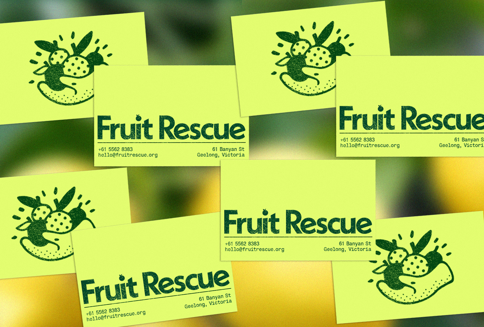

The brand was designed to reflect a sense of community and Fruit Rescue's core values and ethos.
Through a curated ensemble of characters and illustrations,
each element was designed to form a cohesive family that
resonates with audiences and evokes a strong sense of collective
identity - one that is both lively and approachable, reflecting the fun
and friendly nature of the initiative.
The dynamic nature of the illustrations allowed for different elements to be animated, further enriching the brand's visual storytelling capabilities and enhancing its ability to engage and inspire audiences across diverse mediums.
The dynamic nature of the illustrations allowed for different elements to be animated, further enriching the brand's visual storytelling capabilities and enhancing its ability to engage and inspire audiences across diverse mediums.
The brand was created to reflect a vibrant and energetic identity. The
bold use of colours is both eye-catching and contemporary, appealing to
various demographics. I was careful not to exclude any specific
demographic, aiming for inclusivity and accessibility across the board.
The illustrations have been designed to be adaptable across various mediums, encouraging user interaction and engagement. For instance, stickers provide users with a sense of ownership and allow them to form their arrangements. Each demographic interacts with the initiative on different levels and for different reasons, making it critical to consider these factors when crafting the brand.
To facilitate this flexibility, I prioritised the creation of bold, recognisable core elements, including colour schemes, typography, and imagery. These foundational elements enable versatile arrangements, empowering users to interact with the brand in unique and meaningful ways.
To facilitate this flexibility, I prioritised the creation of bold, recognisable core elements, including colour schemes, typography, and imagery. These foundational elements enable versatile arrangements, empowering users to interact with the brand in unique and meaningful ways.
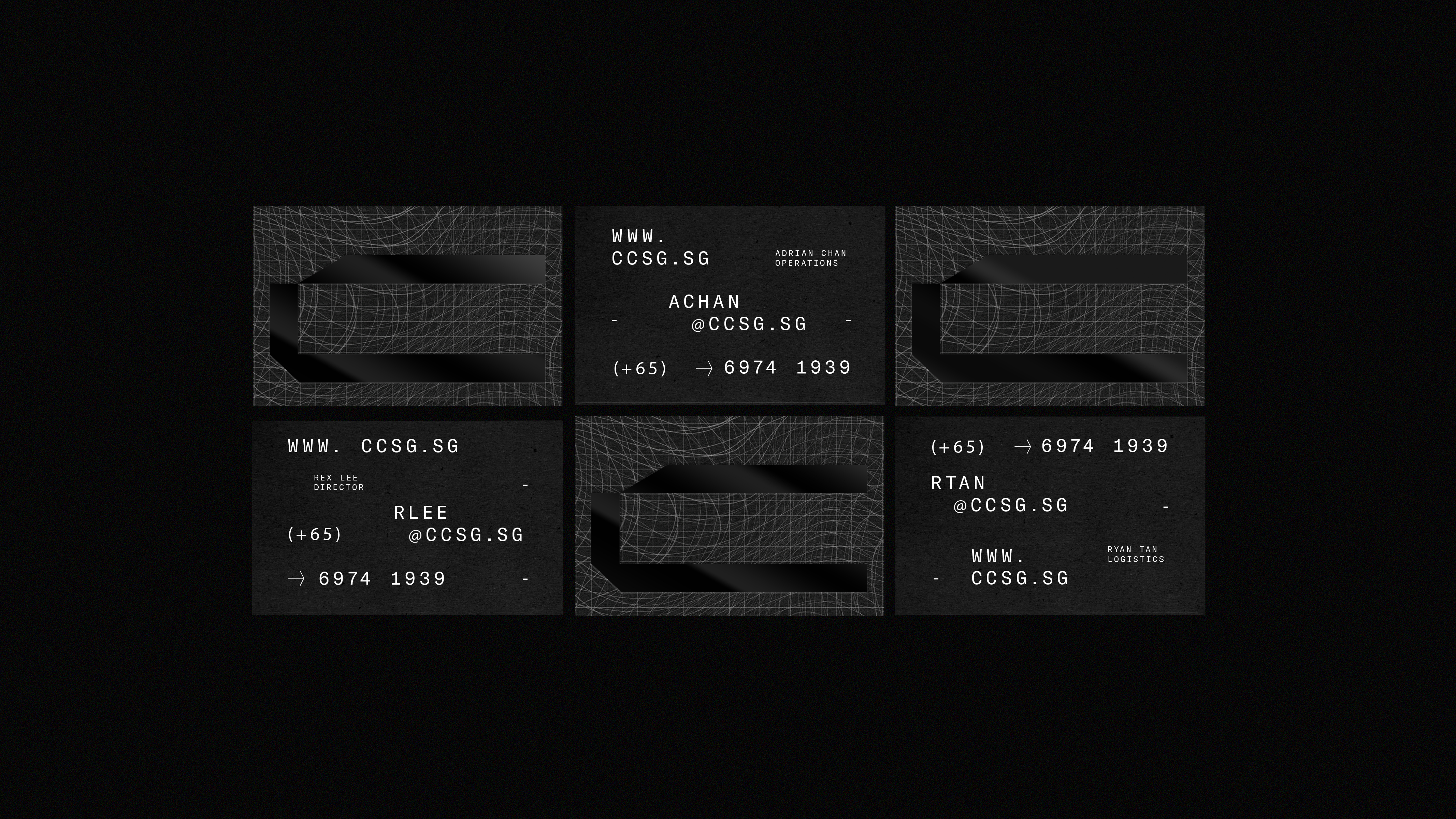
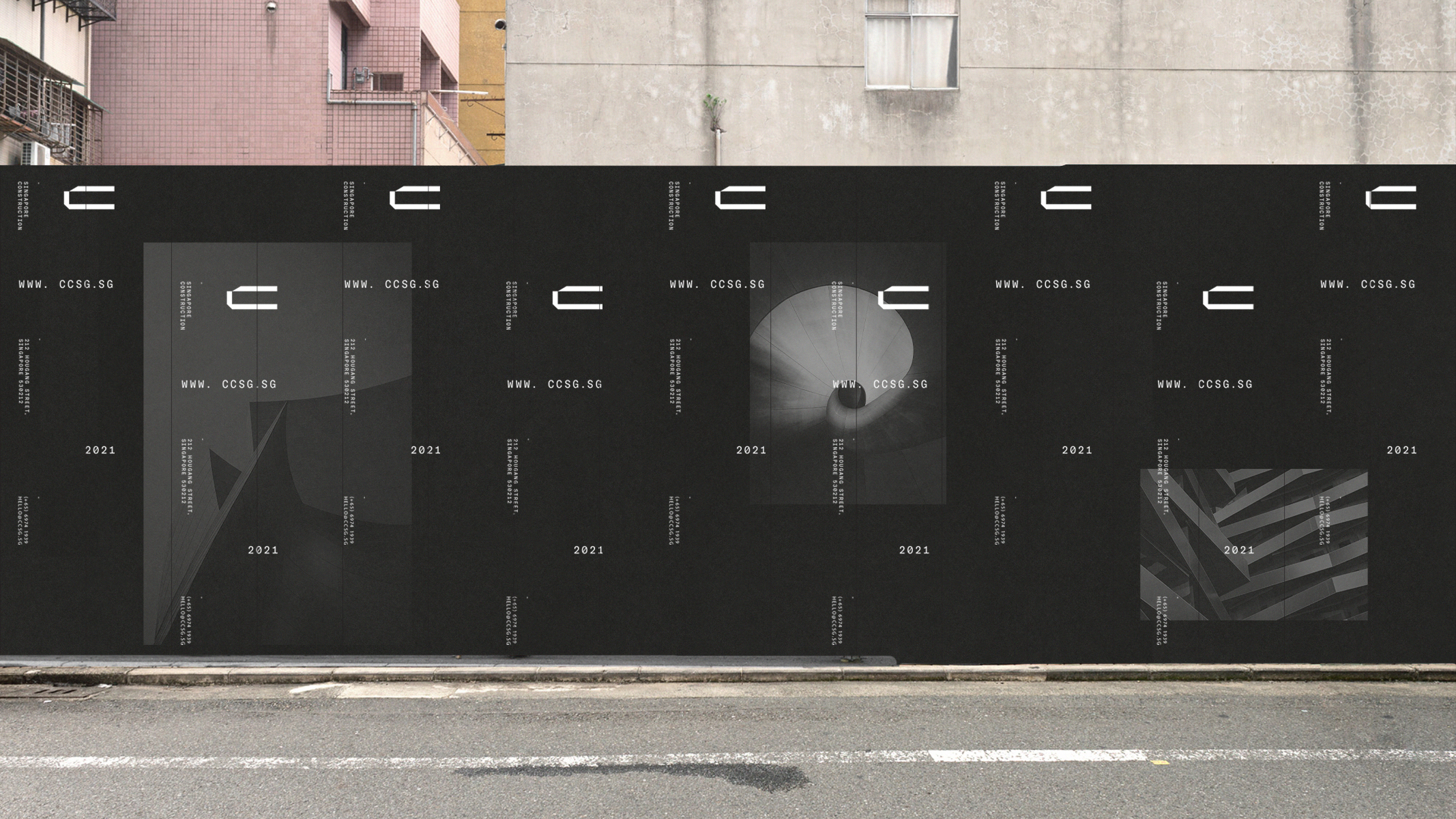
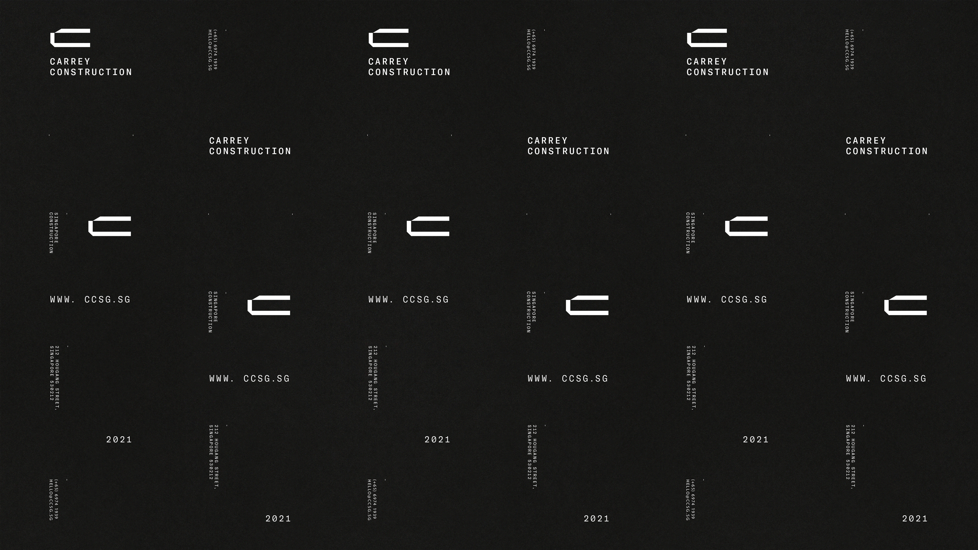
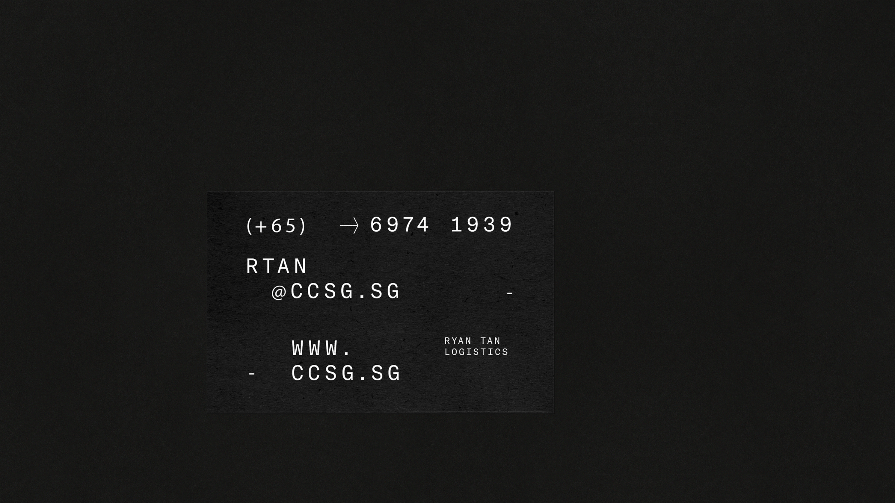
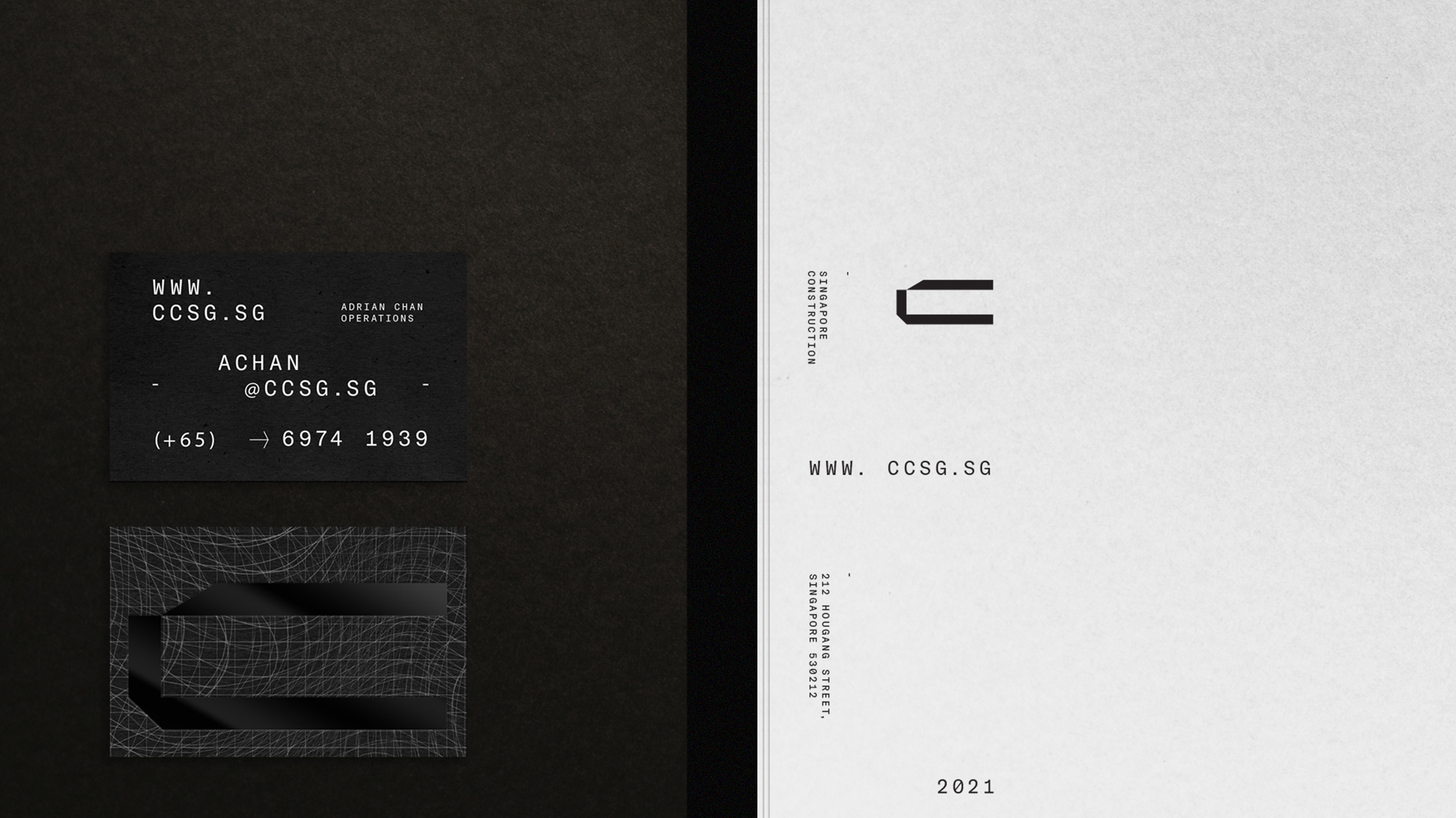
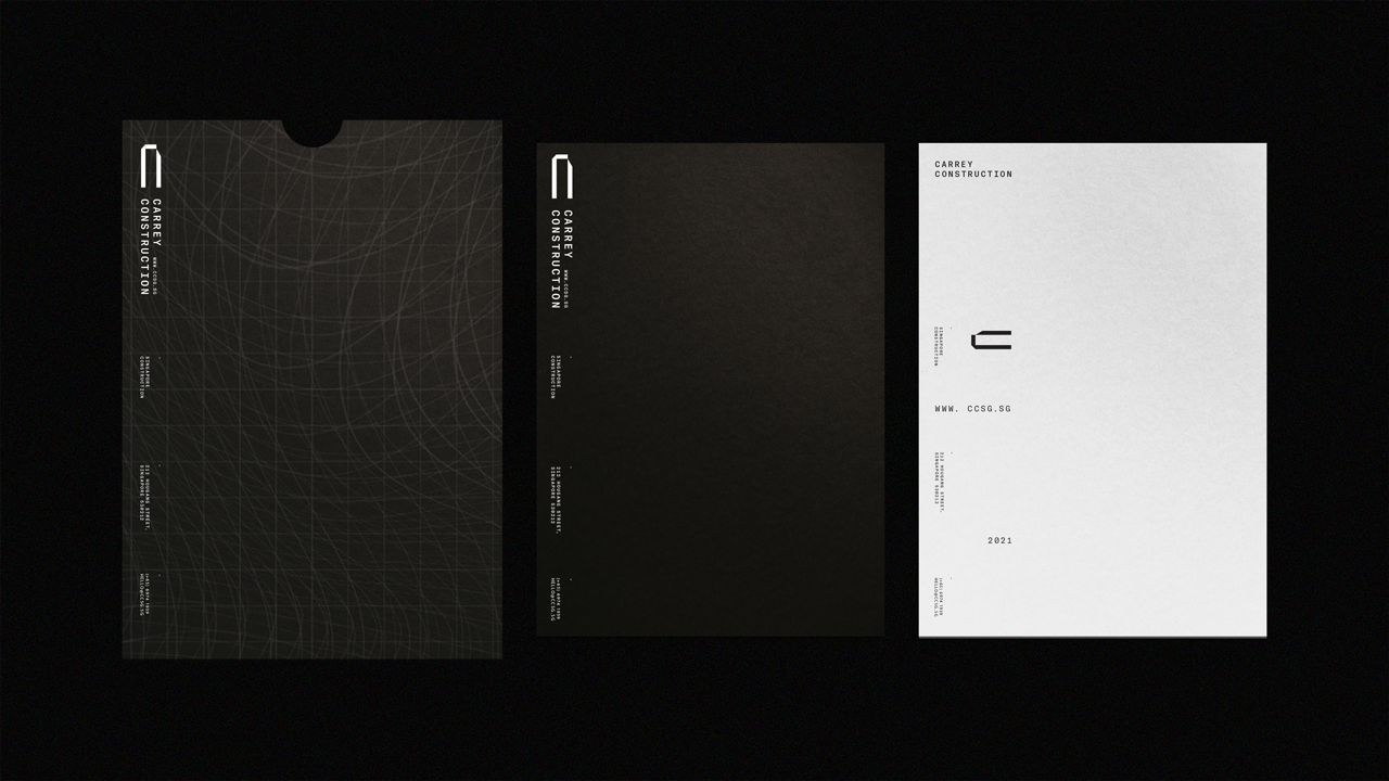
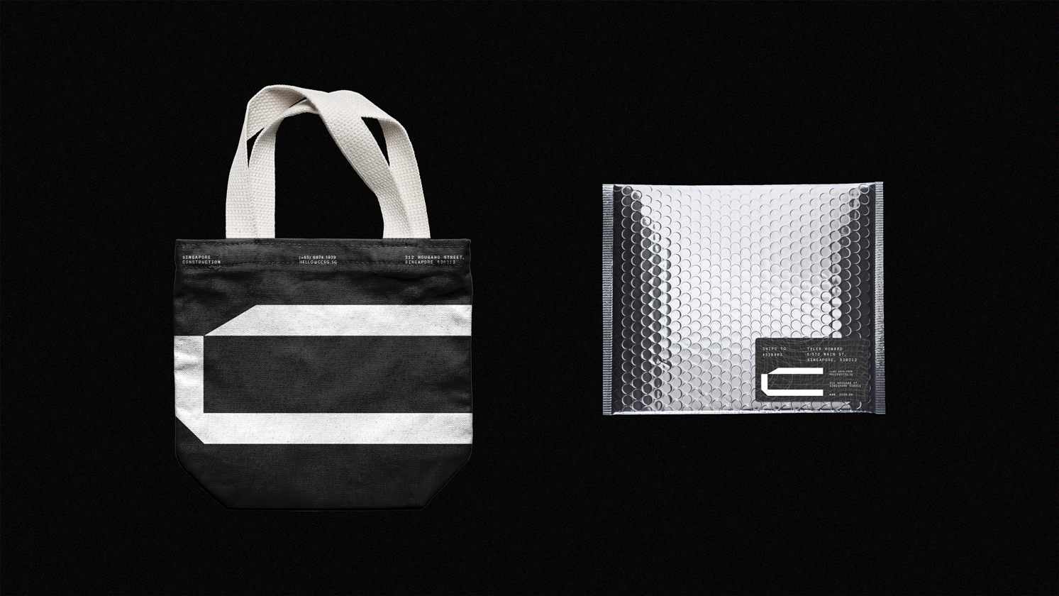
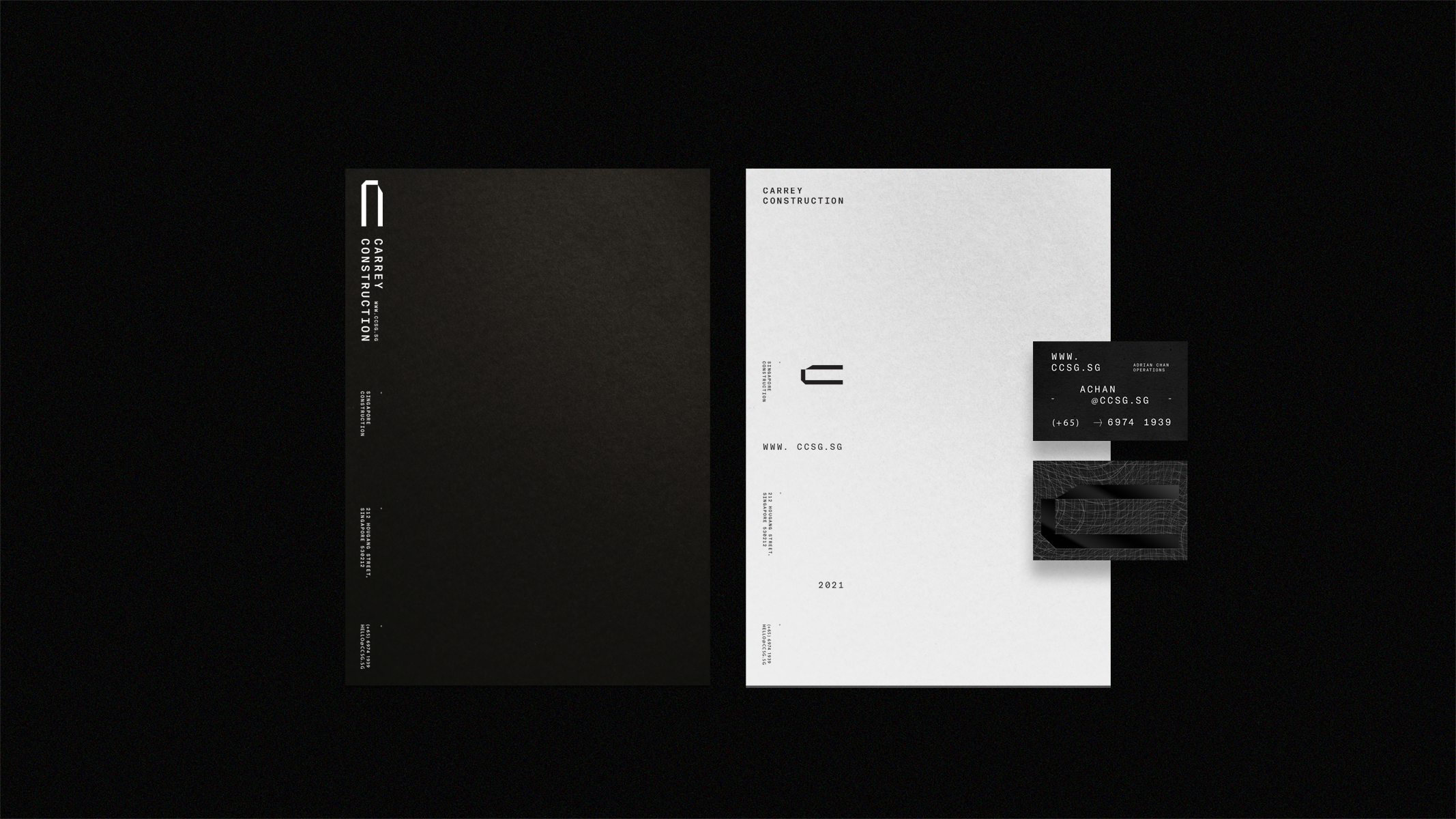
Carrey Construction: Creating Futures
SCOPE: Art Direction, Graphic Design, Illustration, Animation, Web Design
OVERVIEW:
Carrey Construction is a Singaporean construction company. Under the new direction, the brand now radiates a boldy youthful energy, emphasizing innovation, progress, and a strong sense of confidence and authority. The project involved a complete redesign of the company's logo, branded applications, and the development of a brand-new website to reflect this fresh brand identity.

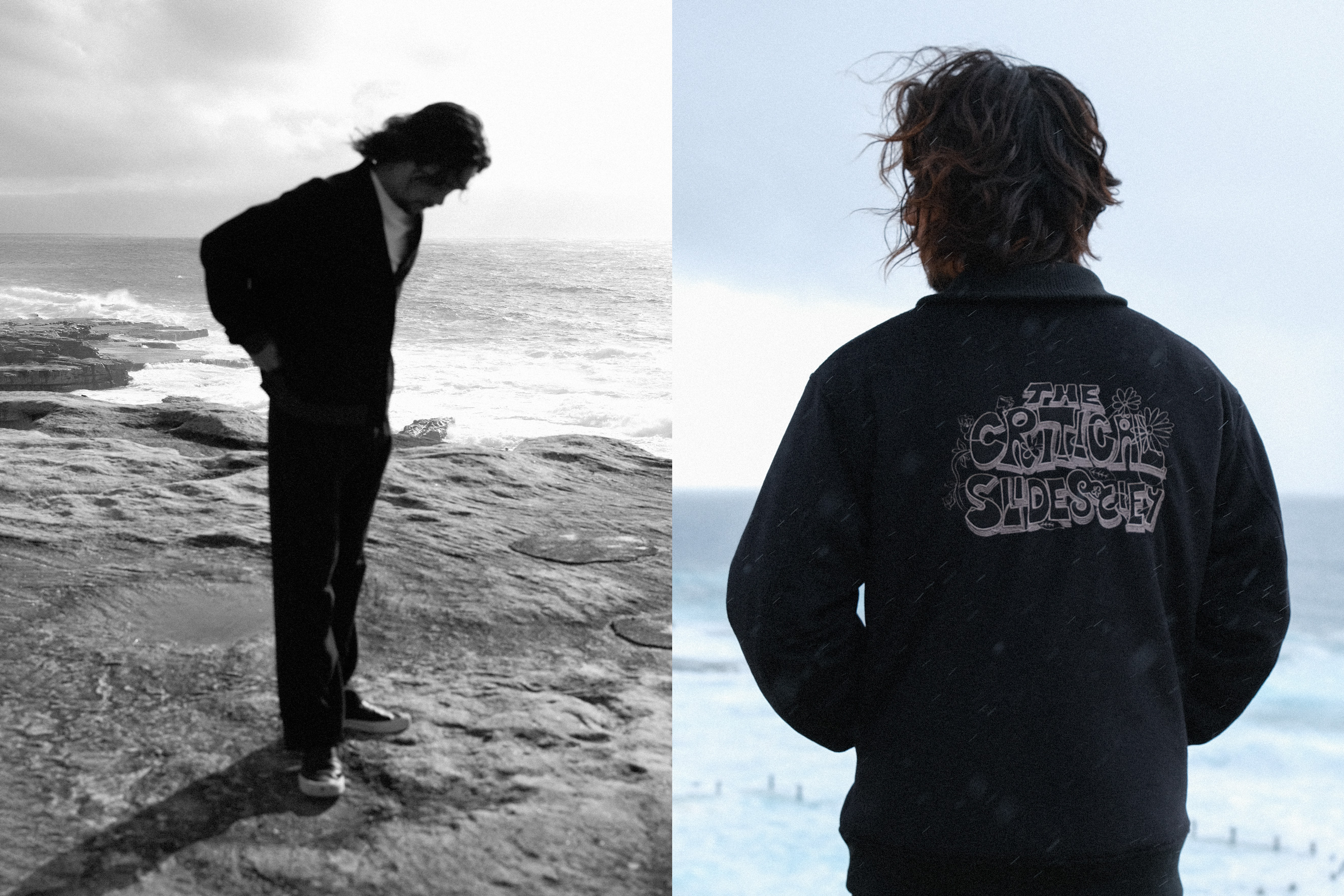
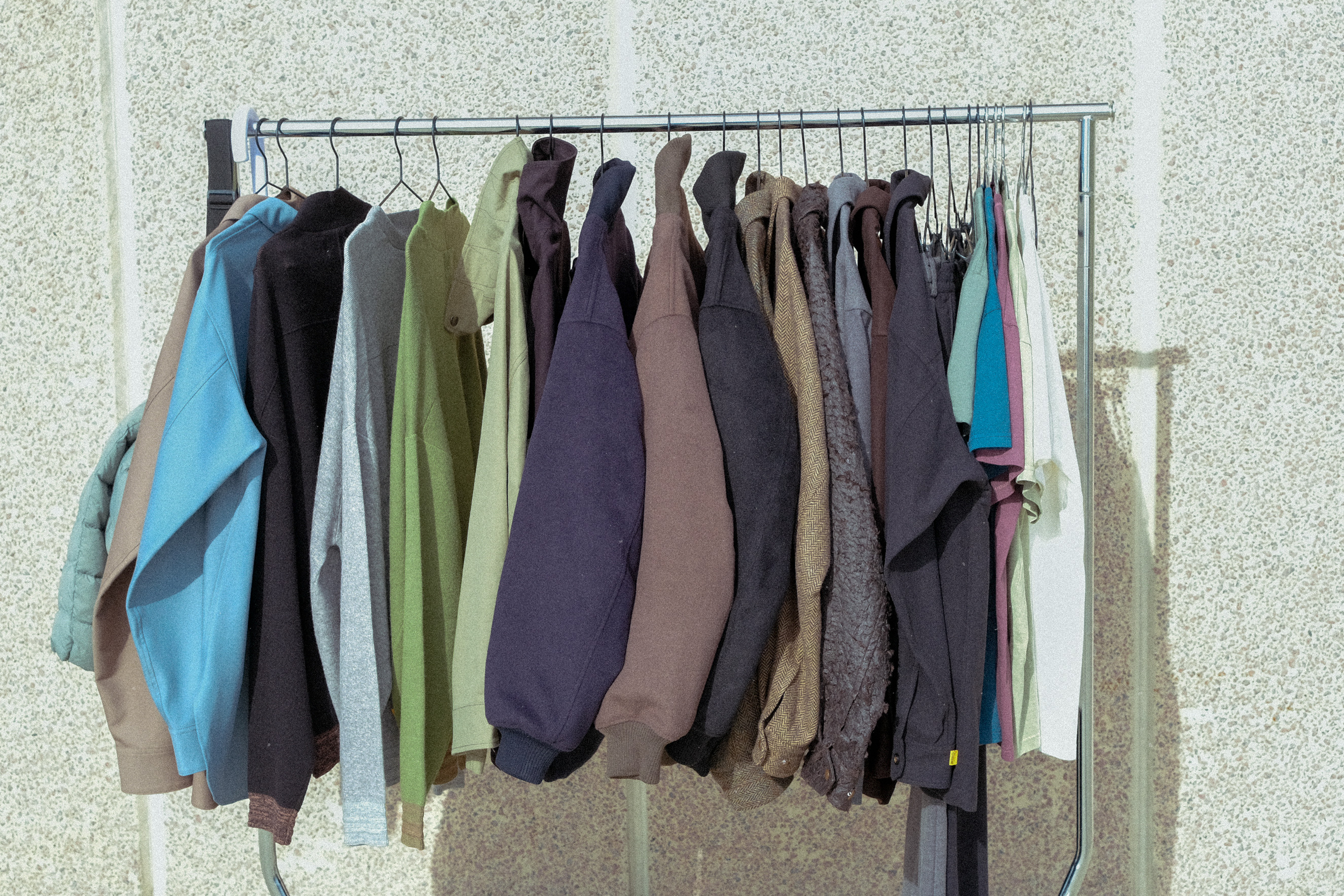
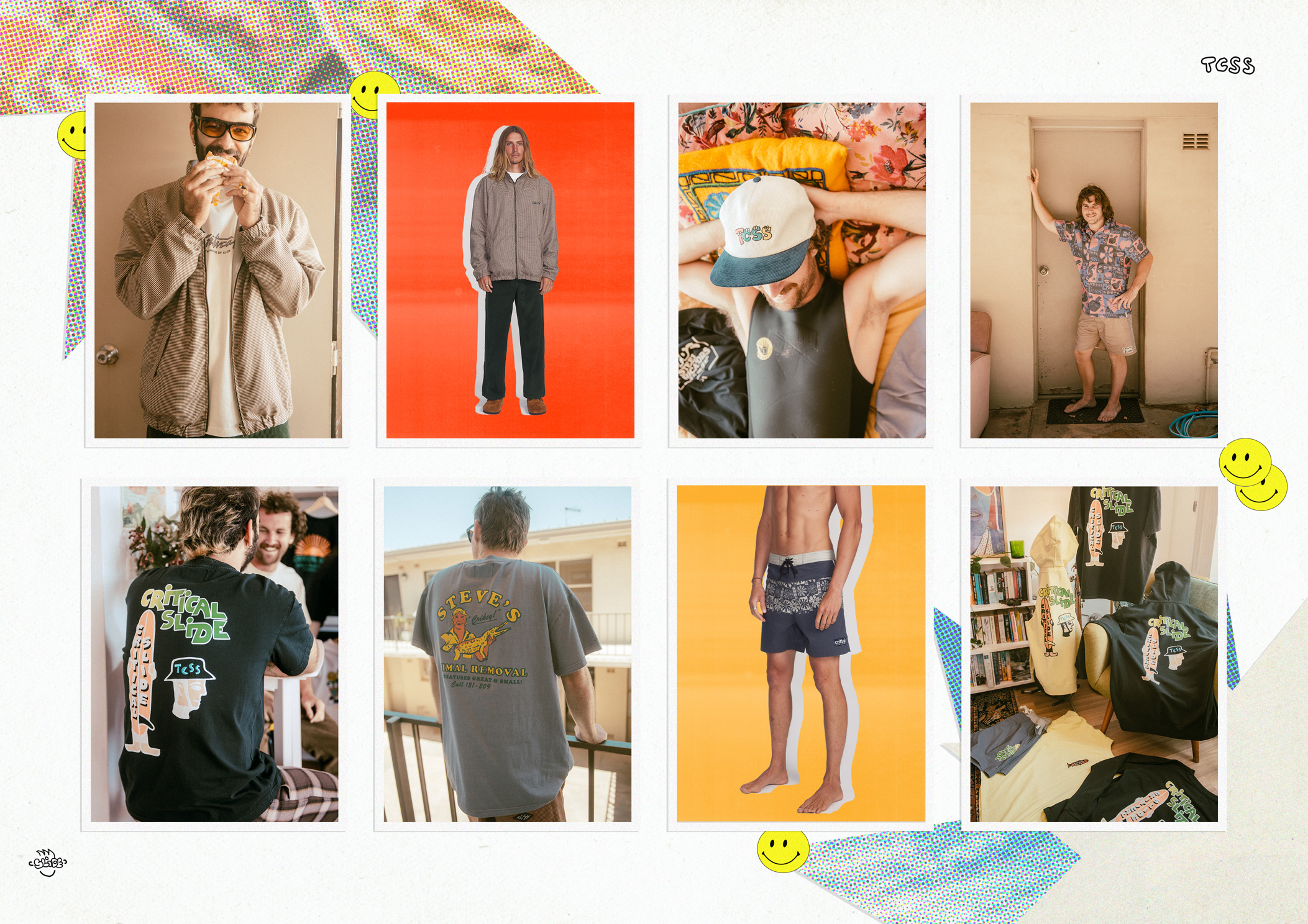
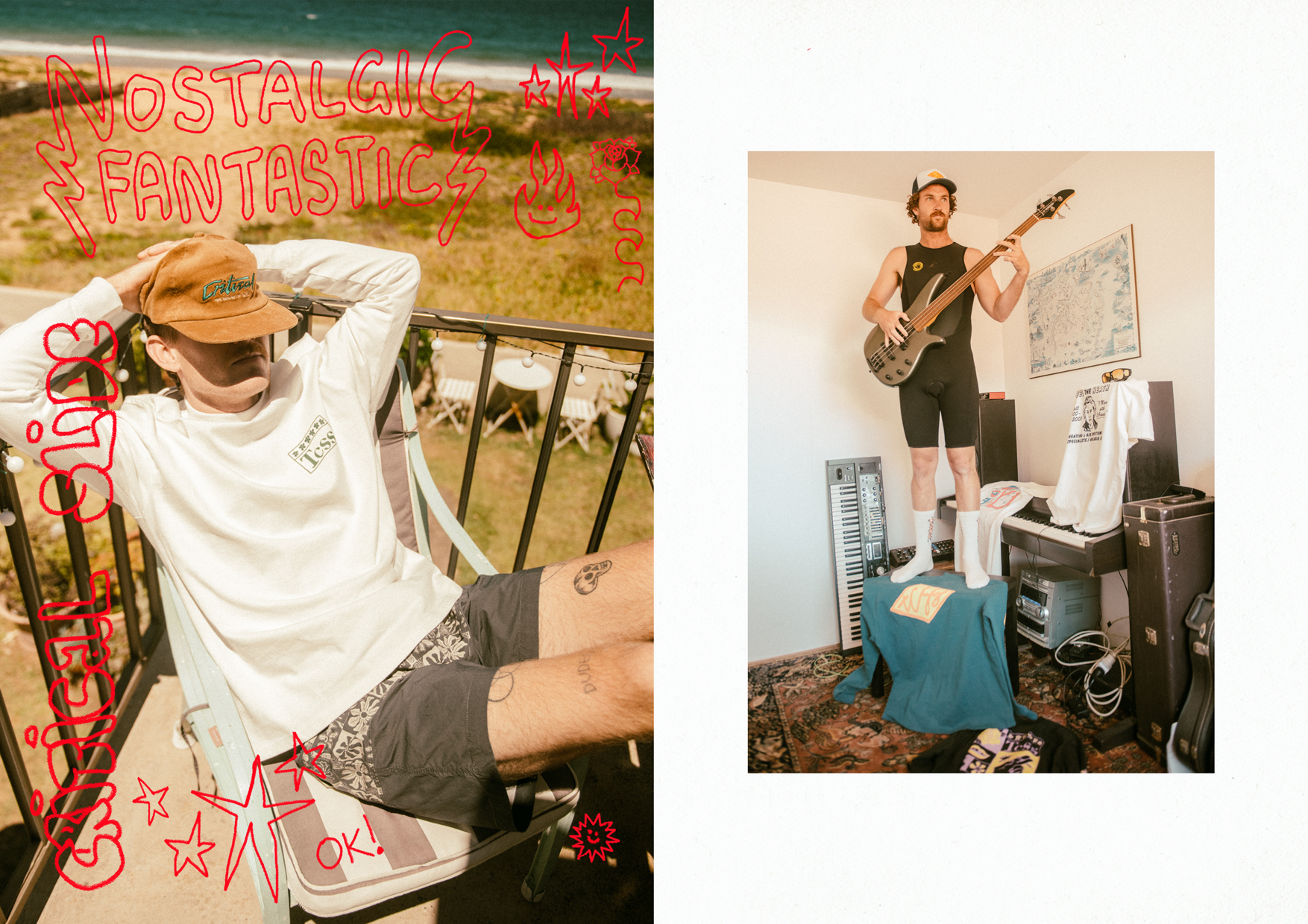
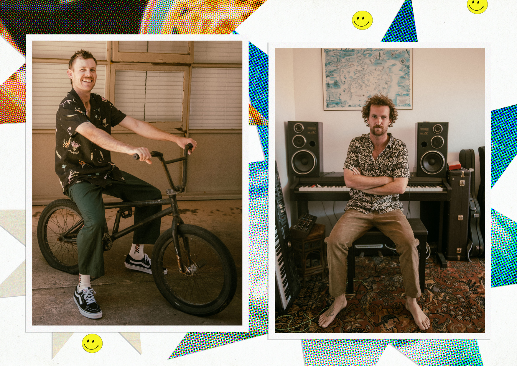
![]() Nostalgic Fantastic
Nostalgic Fantastic
 Nostalgic Fantastic
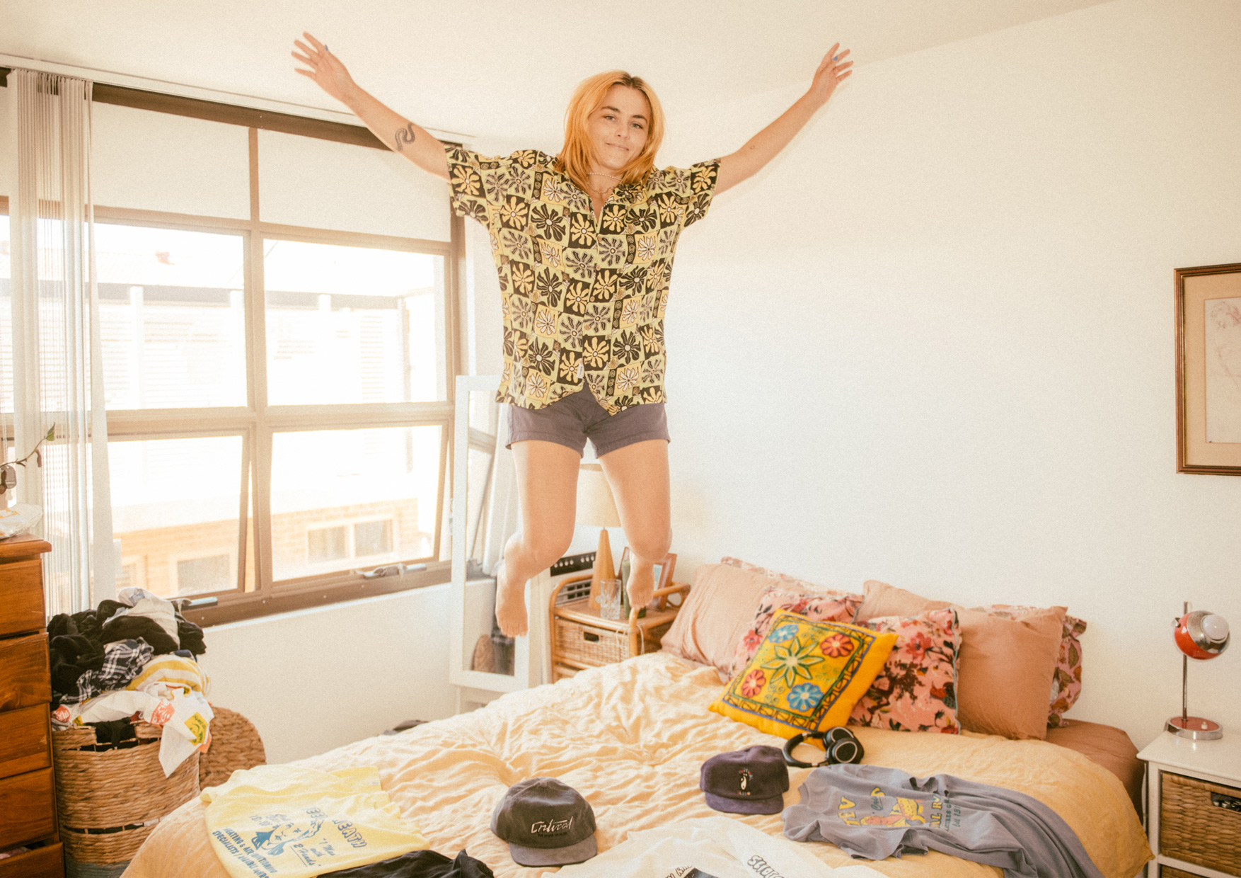
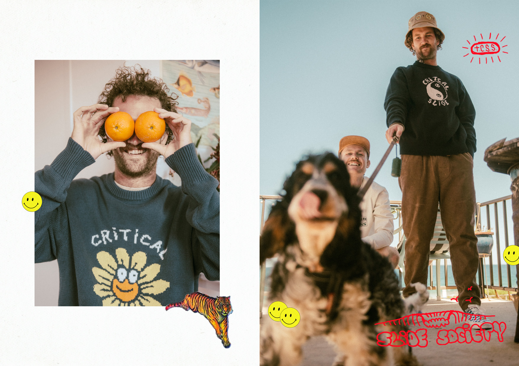
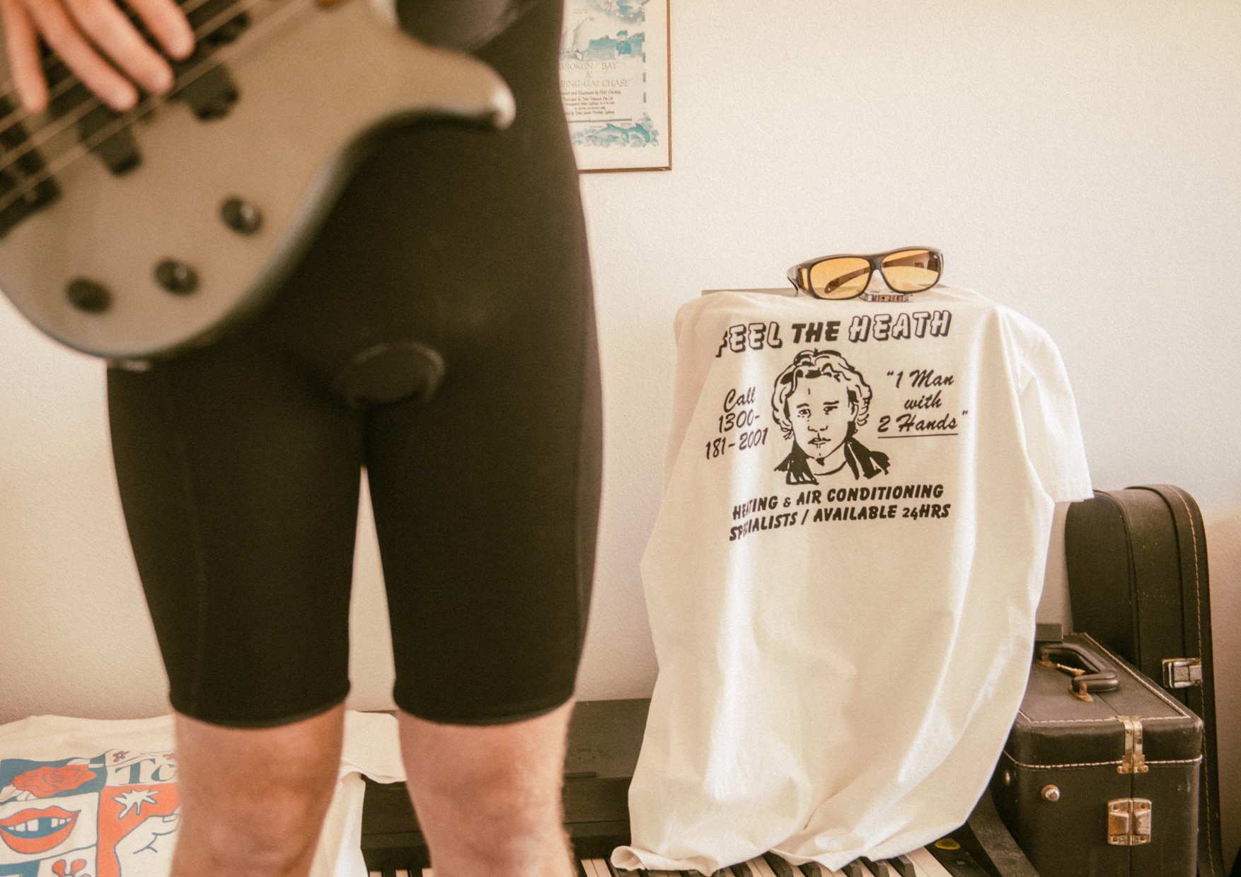
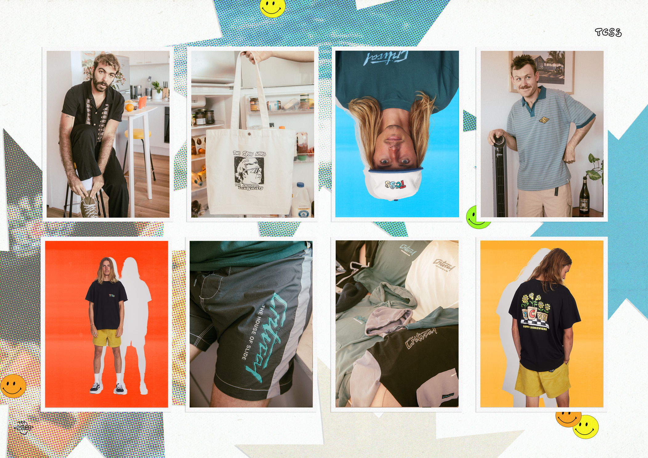
OVERVIEW:
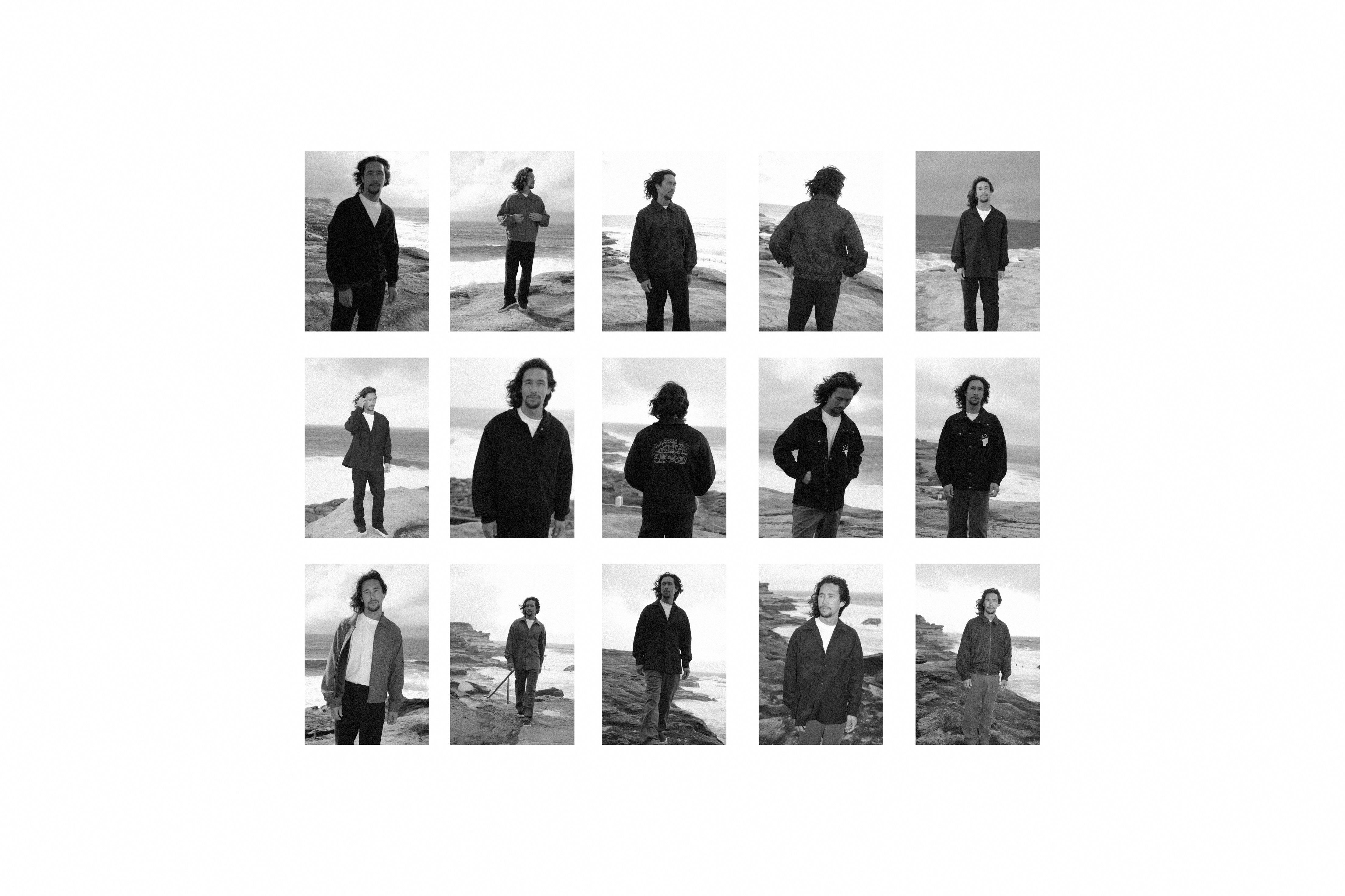
'Nostalgic Fantastic' seasonal campaign by The Critical Slide Society, serves as a tribute to youth, encapsulating the essence of who we are and our cherished camaraderie with our mates. 'Nostalgic Fantastic' captures the energy of carefree moments, inviting wearers to revel in the joy of self-expression and the unapologetic celebration of their youth. This campaign unfolds as a visual narrative that transcends fashion, inviting individuals to connect with the nostalgia of their own fantastic memories of being a care free, cheeky adolescent.

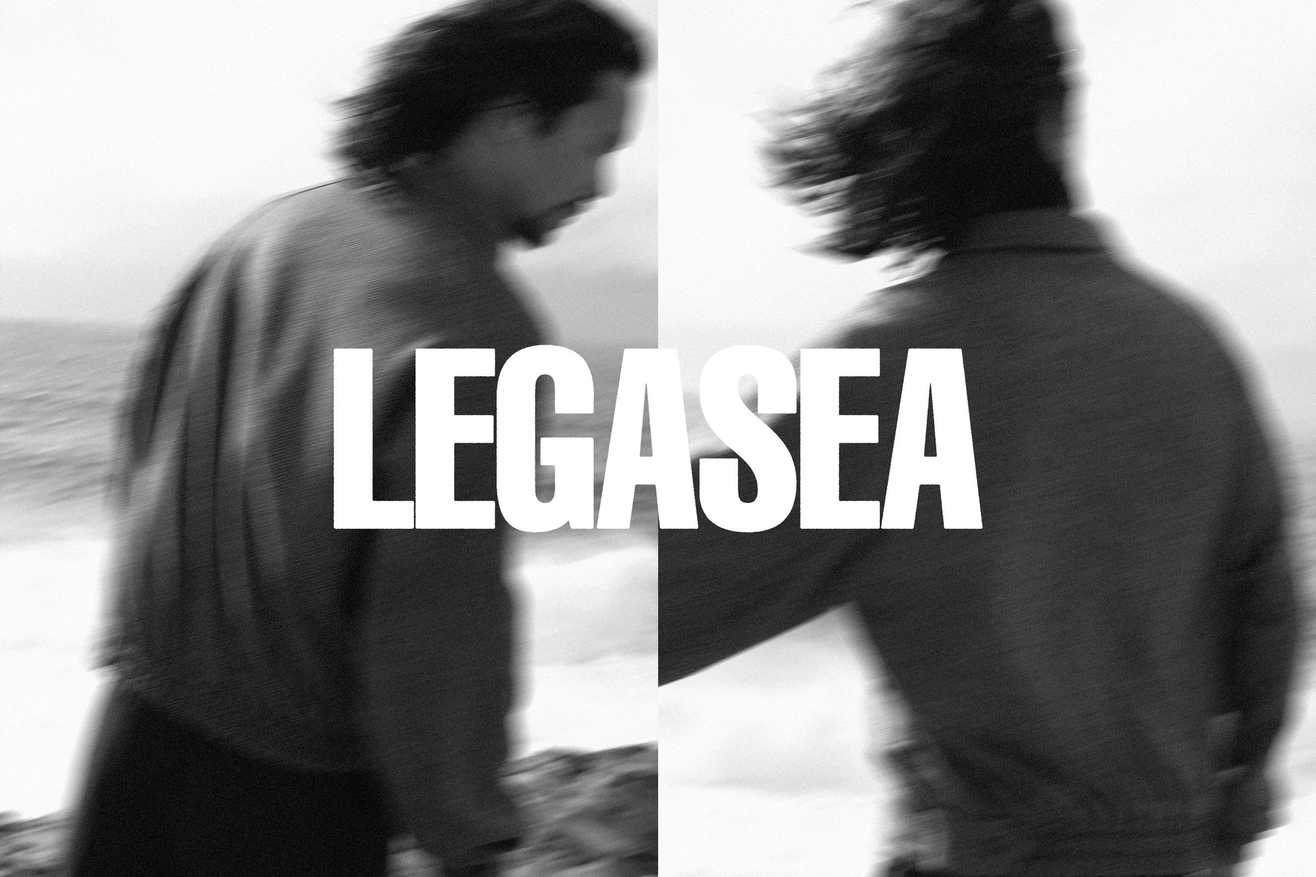
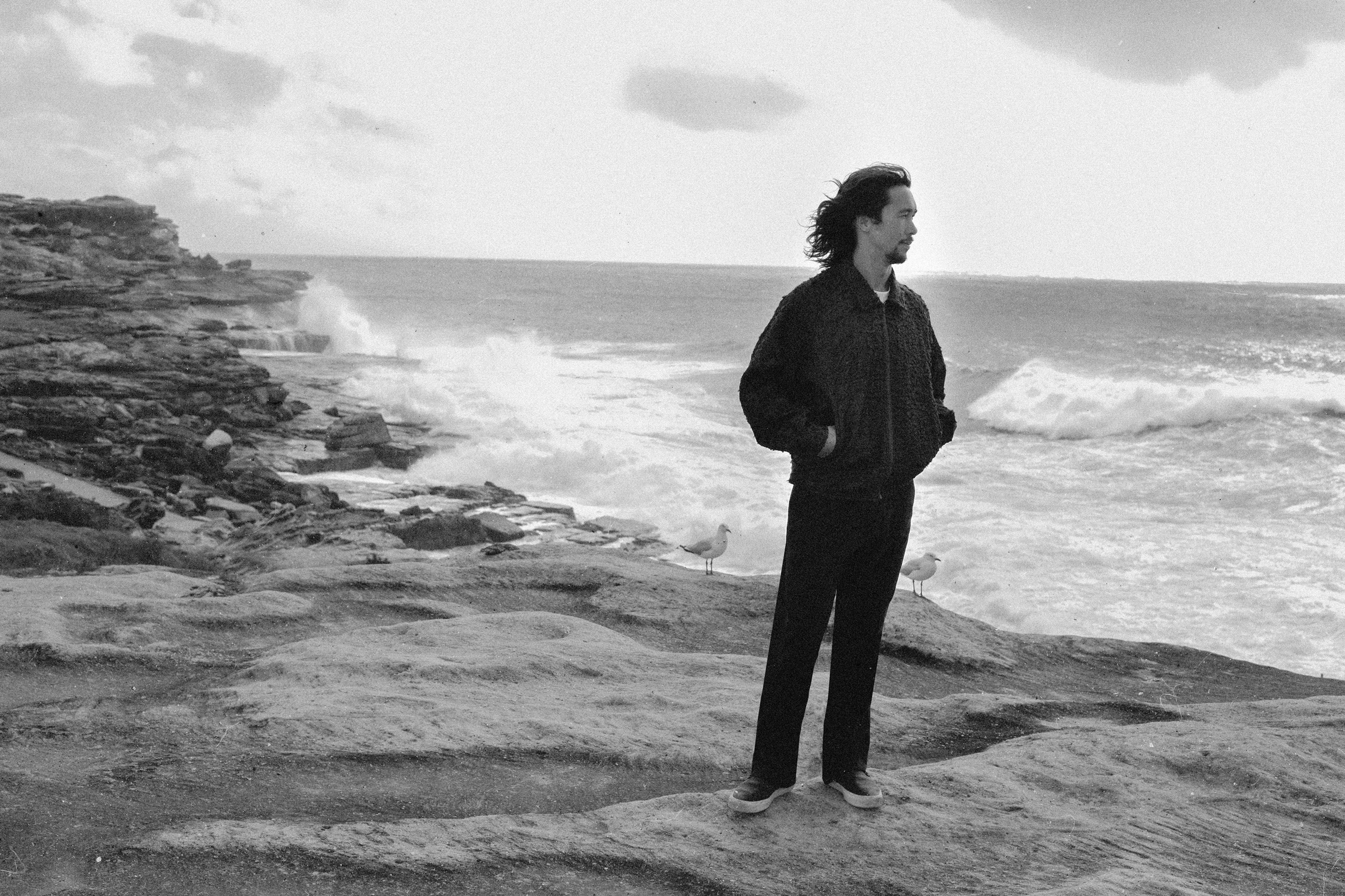
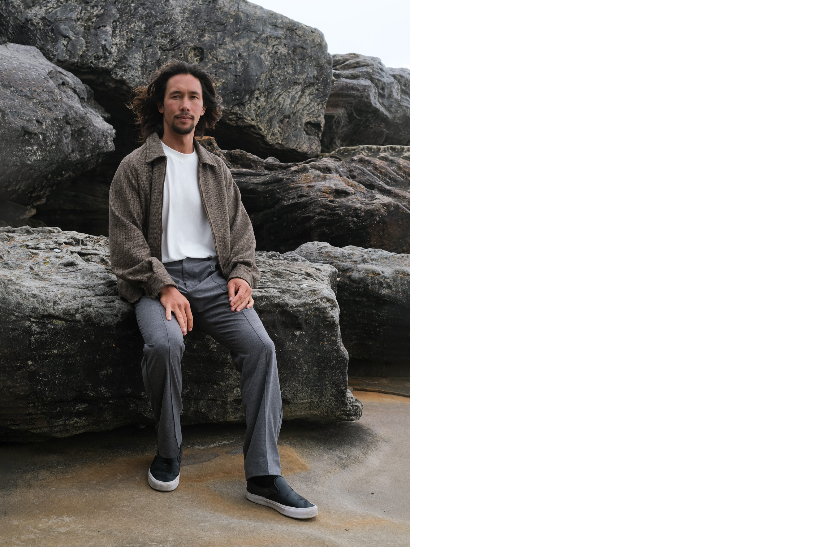
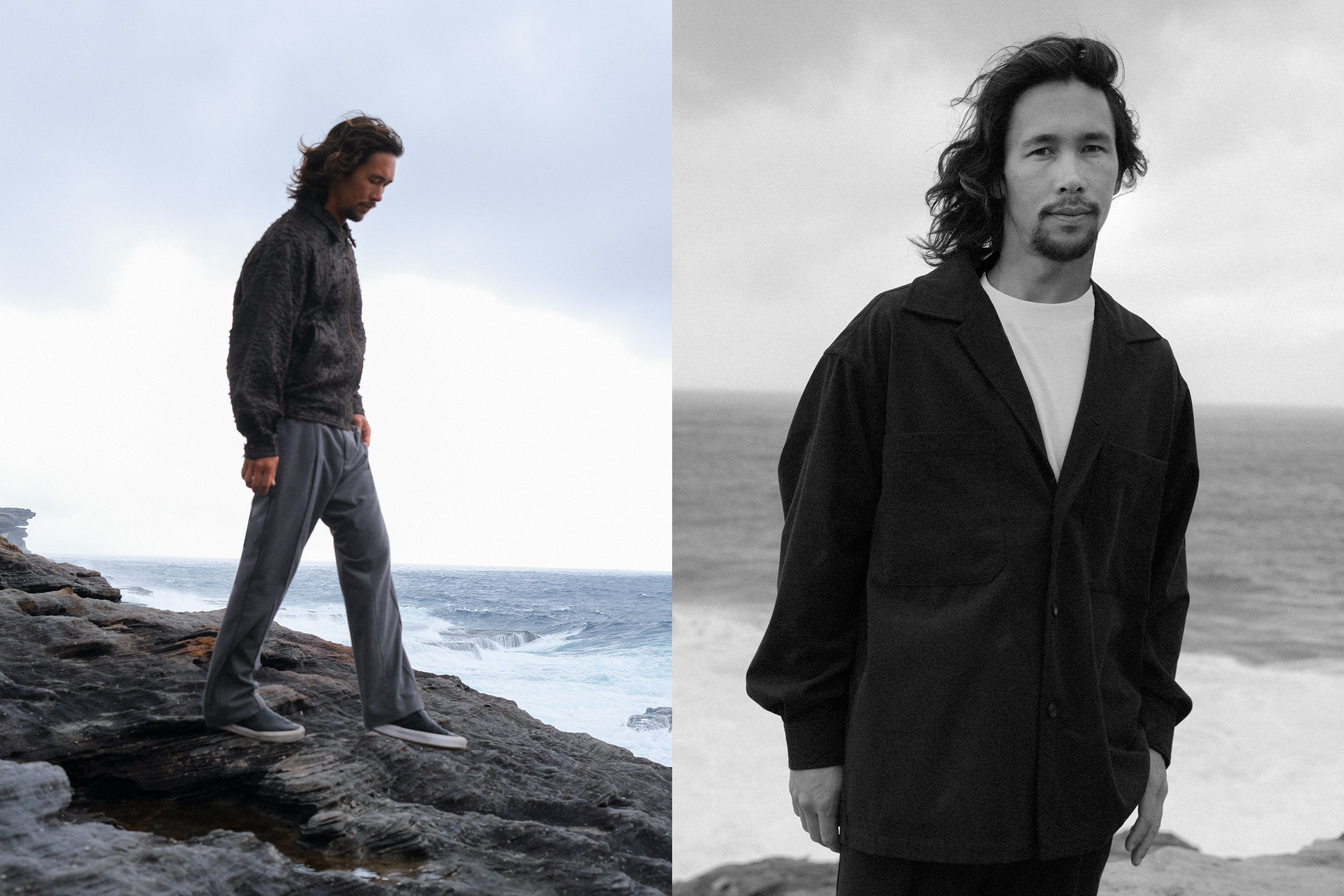
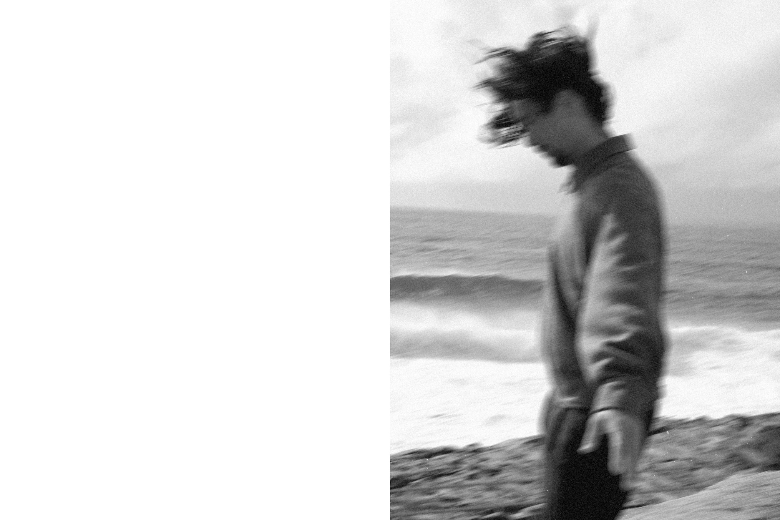
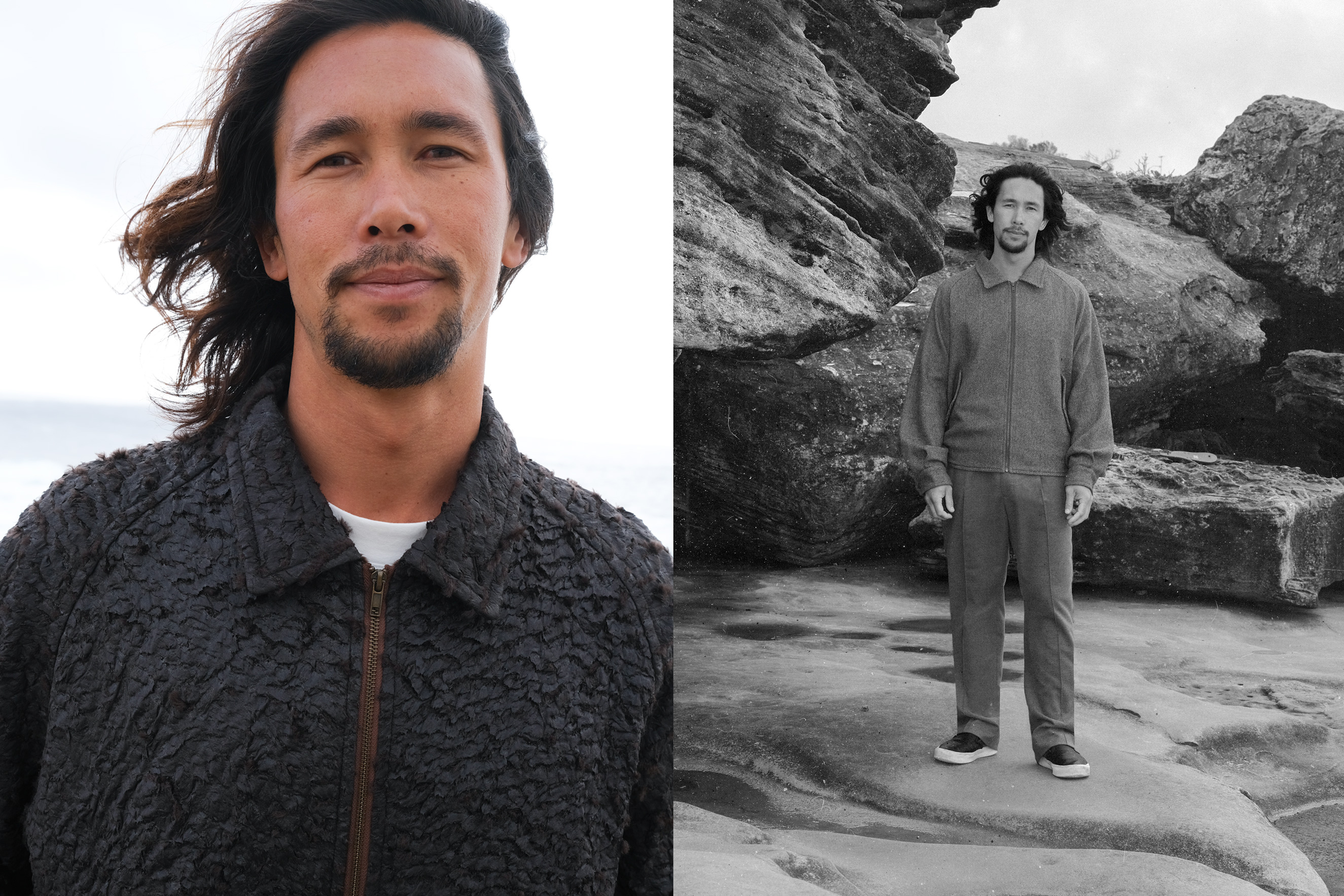
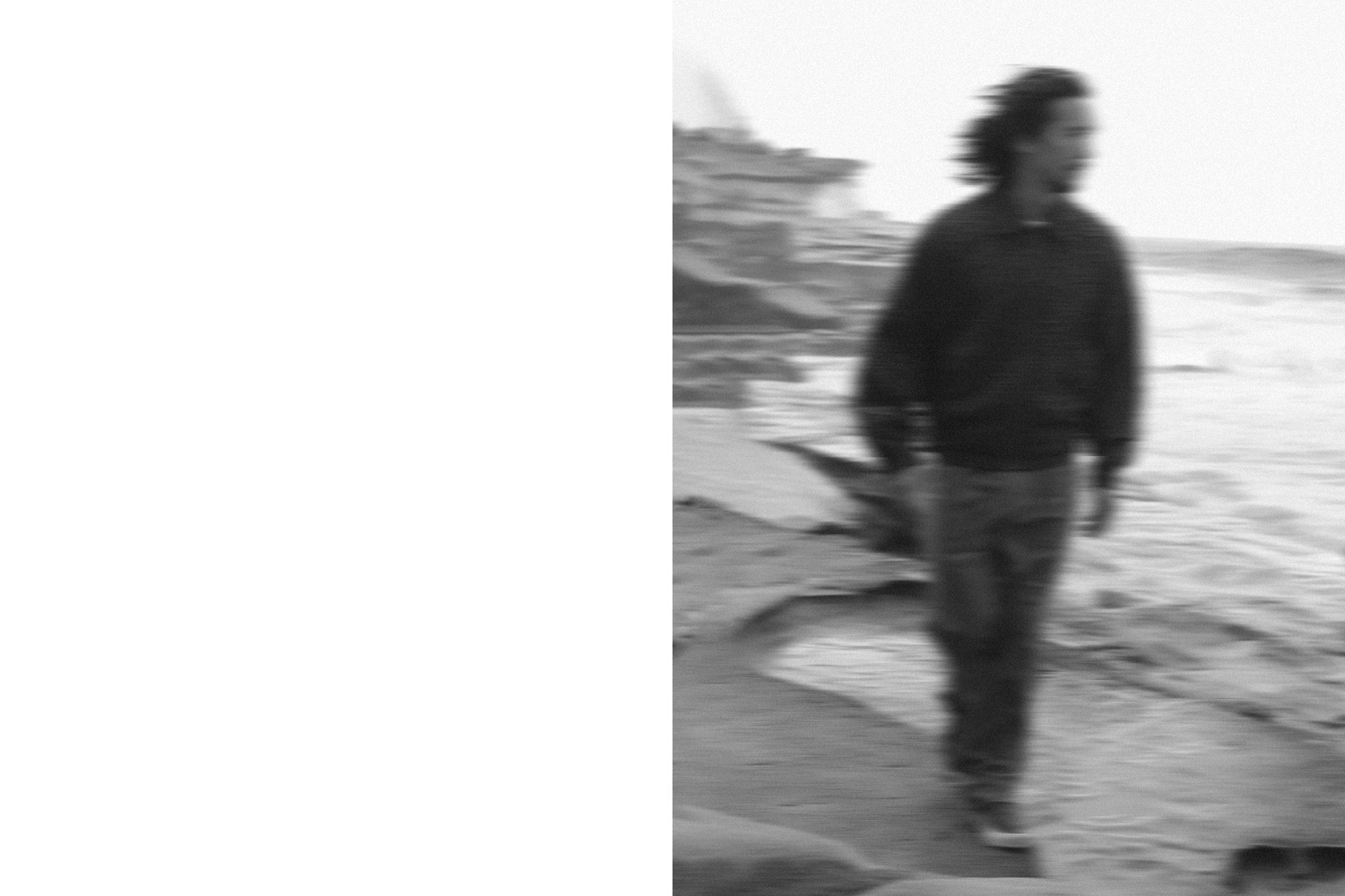
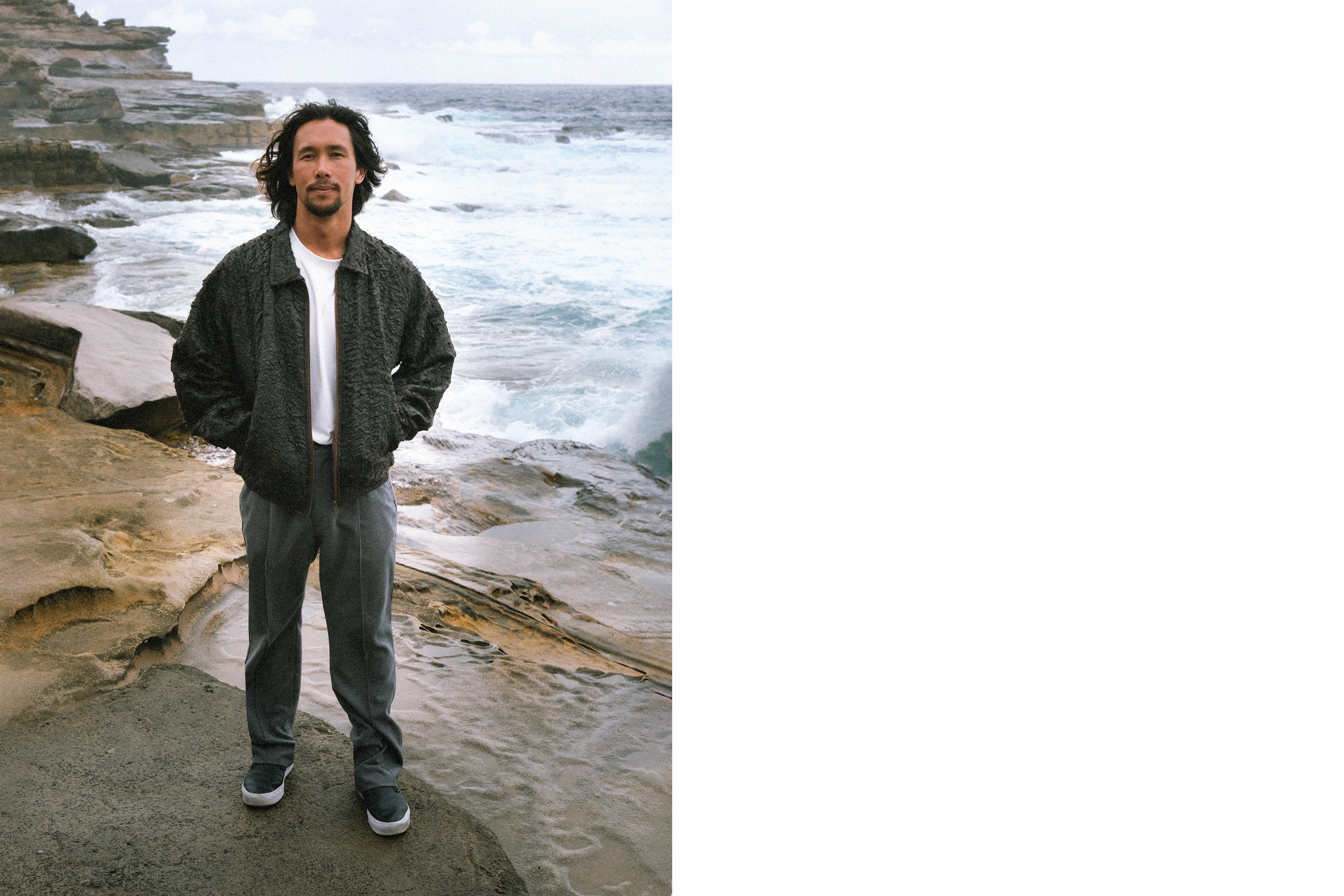
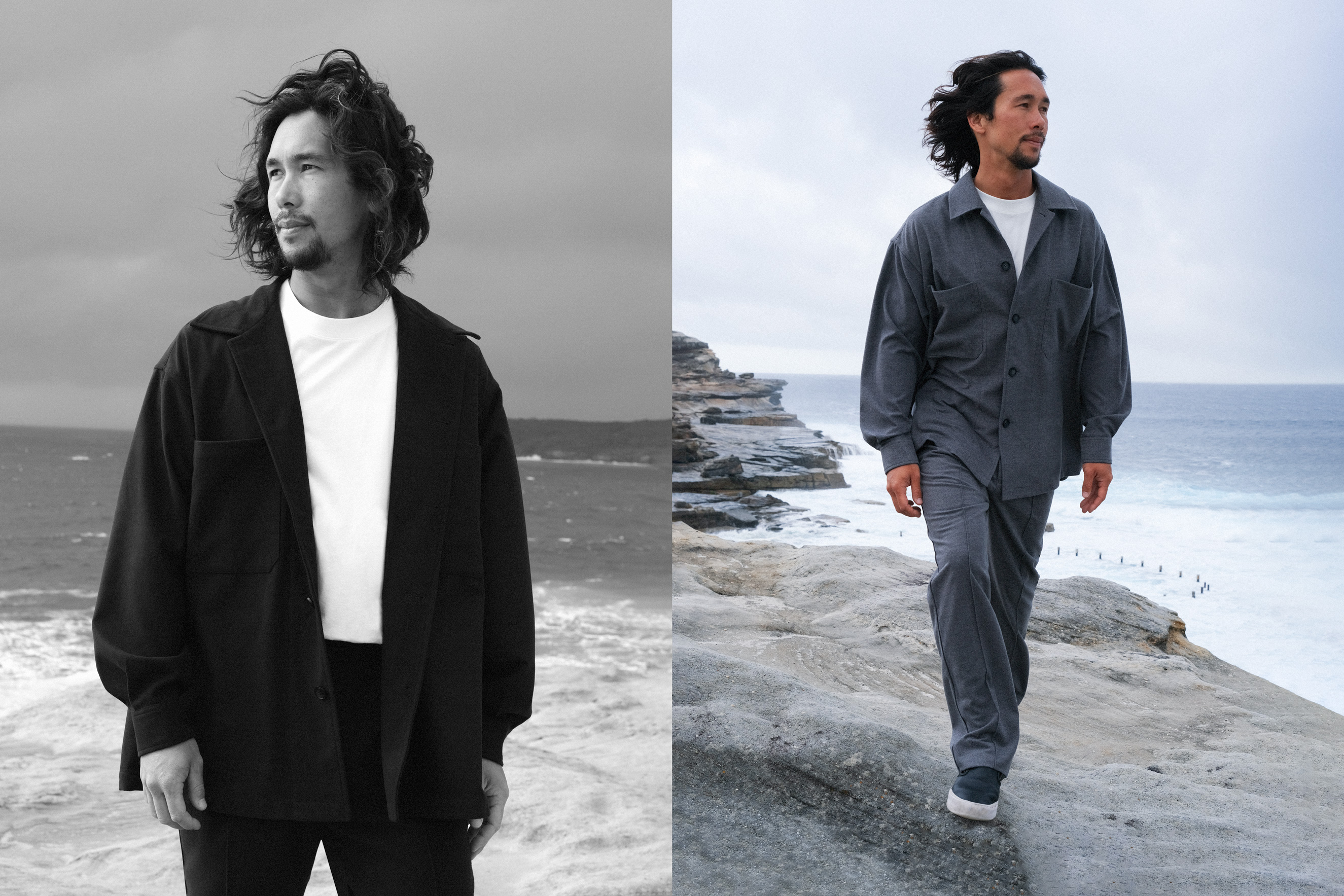
Legasea
SCOPE: Art Direction, Photography, Styling, Graphic Design, Catalogue Design
OVERVIEW:
The 'Legasea' campaign, an exclusive release in Japan by The Critical Slide Society, draws inspiration from the turbulence of the ocean juxtaposed against the stillness captured in an image. Being near the ocean, we can find moments of serenity and peace. Even in wild storms, there's an unexpected element of relaxation. I wanted to highlight this juxtaposition and convey the rawness of being a part of this ecosystem in a way that presents the clothing as an integral component of it.